Our New Logo
This short video showing how our logo was redesigned is curtesy of our marketing partner Orbis Digital Marketing for Small Business.
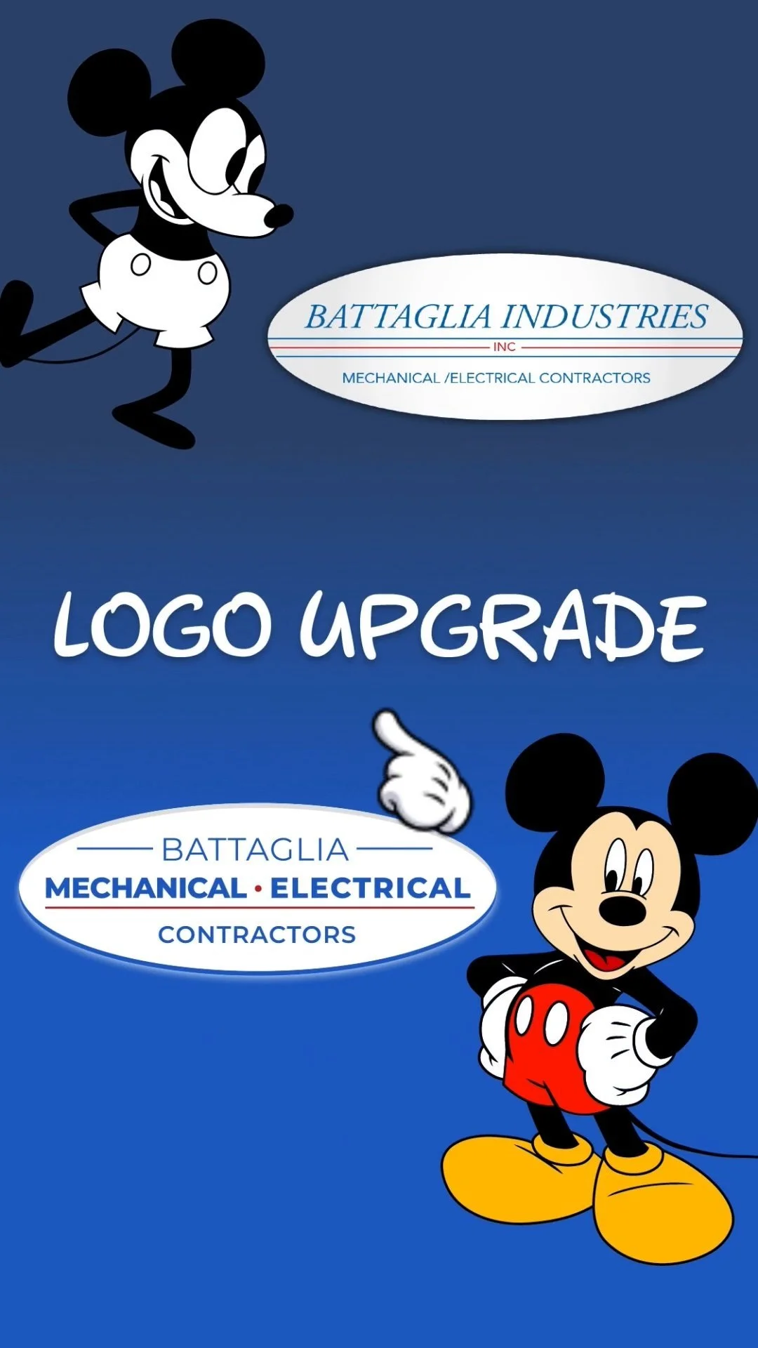
Hey there! Let’s upgrade this website logo without changing it too much so that other uses can change more gradually.
Kind of like how Mr. Disney upgraded me in 1939
So, this is the logo on their current website which we’re rebuilding.
This is the sign in their lobby.
I’m noticing the 3 lines are different.
And the bottom text is italicized on the sign but not on the website.
Let’s adjusted those lines to flow from top to bottom.
Next, sans serif font is easier to read on the web and I noticed when at this client’s facility that their desks are super clean and organized. Sans Serif is considered a cleaner look which helps communicate that.
Now, I don’t believe “Industries” and “Inc” communicate important information from a branding standpoint — so let’s leave make room for the elements that matter.
And, to that end, the words “Mechanical” and “Electrical” are the two most important words for someone meeting their brand for the first time so let’s make sure those are the most important.
And let’s keep using the lines but put them to work balancing the logo and accentuating the key words.
A quick adjustment to the color palette — brighten up that blue.
And finally, let’s combine the drop shadow and the outline into a solid color perspective — making sure it works on a solid blue background.
So there you have it Battaglia.
A work of Art! Like me!

